
Martin’s Supermarkets
Overview
During my 12-week internship at Quad, a leader in the digital marketing and print solutions space, I got to work with Martin’s Supermarkets, a grocer based in Indiana. Founded in 1971 and headquartered in Sussex, Wisconsin, Quad employs nearly 20,000 people around the world across 46 offices.
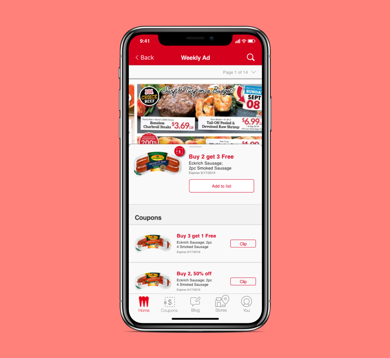
My main task was to improve the usability for the coupons feature of their mobile app.
My Responsibilities
Understand business and user needs
Analyze the the feature’s design and usability
Create a working prototype
Take ownership of the process and end result
Present my work to stakeholders
Roles: Interaction Designer, User Researcher, UI Designer
Design Tools:
Sketch
InVision
Research Methods:
User Interviews
Usability Testing
Digital Ethnography
Competitive Analysis
Impact
The redesign of the coupons feature resulted in decreases in task completion time by up to 50% and increases in task completion rate by 20% for 2 key tasks. Presenting the improved usability metrics to the client helped me get approval for the designs and is now on the 2020 product roadmap.
Approach
I took a user-centered approach to the project, emphasizing collaboration with the team and in-depth user research.

Research
I conducted 5 user interviews and usability tests with heavy digital coupon users to their background, thoughts, and behaviors, toward the coupon feature.
From the usability tests, I recorded both completion rates and completion times for the tasks:
Task 1: Find a coupon for your favorite soda. (Average Completion Rate: 80%, Average Completion Time: 57 seconds)
Task 2: Find your saved coupons. (Average Completion Rate: 80%, Average Completion Time: 42 seconds)
I used digital ethnography and sifted through online reviews to uncover qualitative insights and feedback.
After analyzing over 70 reviews, I found that it was very common for users to feel frustrated about being unable to find their clipped coupons.
I held 2 critique sessions with one of the Senior Digital Designers and Creative Directors at the Quad office to validate usability issues and gather support of my project.
From these sessions, I received validation that the application had poor UX in the following areas:
Navigation
Branding
Writing
Lastly, I conducted a competitive analysis to understand how competitors were tackling their coupons. I looked at apps like Kroger, Flipp, and Meijer.
I found it was common for these apps to have the following characteristics:
Ability to clip coupons in the Weekly Ad
Had displays of coupons that were easy to scan
Modern UI
Problem
Poor navigation, obtuse language, and inconsistent branding caused confusion for users.
This caused users to be less engaged with coupons, resulting in decreased sales.
This frustration led customers to opt for using apps built by competitors instead.
Persona
After conducting interviews and digital ethnography, I created a persona to summarize user needs and behaviors.

“There is limited usefulness. Clipped coupons are no where to be found!”
Heavy Coupon User: Holly, 50 years old
Holly is a full-time receptionist at her company. She LOVES to save. She used to use physical coupons a lot, but switched to digital a couple years ago. In general, she’s not very tech-savvy.
She saves because she has 2 daughters and grandchildren that she needs to take care of. When life happens, she’ll use money saved from coupons to take care of them.
Other than shopping at Martin’s Supermarkets, she likes to shop at Kroger and Meijer for savings.
Usability Issues
After conducting usability tests, I communicated my findings with a short presentation of captioned screens.


Ideation(Sketches & Wireframes)


Prototype


Summary of Impact:
While testing the prototype, I used similar tasks and measured the same metrics.
Task 1: Find a coupon for mac and cheese. (Average Completion Rate: 100%, Average Completion Time: 25 seconds, a 56% decrease in time)
Task 2: Find your saved coupons. (Average Completion Rate: 100%, Average Completion Time: 22 seconds, a 48% decrease in time)
Stakeholders believed design has high ROI.
Updated/modernized design to keep up with industry trends.
Closing Thoughts & Next Steps
While UX is a key focus within Quad, UX is still a fairly young discipline within the company. I found myself working on a team filled with business analysts and project managers, which turned out to be a challenge when getting design feedback. This forced me to be resourceful and look outside my team to get the feedback I wanted. I learned how to trust my design knowledge, over-communicate, and explore how my designs can affect business.
If I were to work on a project like this next time, I would:
Try out micro-interactions
Bring in team members, users, and client to co-design
Implement feedback from last round of testing
I found in testing task 2, a recurring issue was mistaking clipped coupons to be within the profile feature.